
YouTrip UIUX Redesign
UIUX | Brand Identity | Art Direction
Pay overseas and track your transactions with ease. The following case study is a proposed user experience and interface refresh of the multi-currency mobile wallet - YouTrip. The UIUX refresh hopes to enhance existing customer experience by allowing them to easily track their overseas transactions in an effective manner.
New and improved
YouTrip exists as a multi-currency mobile wallet that supports payments online, and at POS (point-of-sale) terminals worldwide, in over 150 currencies at zero transaction fees.
Fundamentally, it provides convenient payment, conversion and exchange features, ideal for travellers and shoppers alike. The new and improved YouTrip was envisioned to have a key brand signifier: a product that’s reliable, convenient, and most importantly, perceived as secured and trusted.
With a strategic framework, YouTrip’s new brand refresh consists of an employment of new colours, and a contemporary visual system. Instantly recognisable, with bolder hues and distinctive complementary colours.


The Problem:
Youtrip at a glance
Users need a better way to efficiently track their wallet activity and spendings overseas, so that they can top-up and spend with ease - granting them time, and avoiding any uncertainty and inconvenience.
Solution
To improve overall transaction page within the app by introducing new functions, making it possible for users to receive accurate search results and have better control over their wallet activity.
Re-framing YouTrip purpose
01 App Review

02 Research

03 Strategy

04 Design

05 Test & Key Takeaways

01 App Review
When users launch YouTrip, they would first encounter the dashboard featuring transaction histories, wallet balance in various currencies, and the top-up and exchange features.
The tabber navigation also highlights the core features of the app, one of which is “card” - where users can view their card functions, the option to lock and unlock their card, or even request for a new one.

Dashboard

Transaction history
Top-up

Exchange

Card functions
POV statement
Travelers who rely on multi-currency accounts for their spendings need to have accuracy and constant accessibility to review both recent and past transactions, because finance tracking is time-consuming and having to go through a long list of details can be frustrating.
02 Research
Instead of relying on a straightforward problem-solution mindset, a casual research-conversation was started to better understand and relate to the needs of users. This will help to reveal some valuable information that can be fed into the design process.
Initial Findings
User Research & Insights (10 users)
User Personas
Initial Findings
I did some research online to gather users’ general response and feedback. This was done to seek better understanding of their current pet peeves and how the refresh might serve better them better.

https://seedly.sg/reviews/multi-currency-cards/youtrip-card/
https://play.google.com/store/apps/details?id=co.you.youapp&hl=en_SG&gl=US
User Research & Insights
With the data gathered during the initial findings, I conducted interviews with 10 YouTrip users age 23 - 35 year old, living in Singapore. In order to dig deeper into the motivations and behaviours of the users, interviews were done in person or over a video call.


Insights
At the get-go, these conversations provided me with useful insights such as:
Users utilise the top-up button the most in the app when they are making cross-border purchases. This creates a prompt to feature a cleaner dashboard where the top-up and exchange module would occupy 3/4 of the screen, since majority of users take advantage of the convenience of the feature.
2. Most users were also seen scrolling through their transaction history to quickly glimpse through their overall spending on the app. To enhance easy tracking, improvement in the search button and filter option would allow users to easily track the different card activities. (Top up, exchange, send etc)Most of the users were unaware of their total spendings, since the concept of “top-up and spend on the spot” is a common practice. Users should feel at ease, and in control of their money. They should be able to see the following breakdown (transaction, expenses, regular auto notification for daily purchases made)
It seems like transaction tracking is the main concern for YouTrip users. They want to be independent and be in control of their overall spendings, this leads us to ask the question..
↳ How might we improve transaction tracking for existing users to increase awareness of their general overseas finances on YouTrip.

-
Business Consultant
Charlie is a 31 year old business consultant working in a startup company. Because of the nature of his job, he frequently travels for work. He uses his pocket of free time to go shopping, and indulge in relaxing activities enabling a better work life balance. However, his wife thinks he is spending too carelessly on frivolous items, and thinks he should ensure be more prudent with his expenses while traveling.
Charlie does not have a habit to check for exchange rates, therefore would sometimes overspend.
-
Aims to be more well informed about the conversion rate before making a purchase
Be prudent with his expenses while traveling
-
Not being able to sort and categorise his expenses when using YouTrip
Oblivious of the daily exchange rate
Struggles to top-up his card on time when making his purchase.

-
Digital Nomad
Mabel is a free spirited individual that works for a fully remote fin-tech company. Because of the nature of her job, she has decided to pursue a digital nomad lifestyle where she's granted the opportunity to constantly be on the road in search of new adventures while working.
Since she travels a lot, Mabel packs light for the ease of moving around, therefore heavily relies on contactless and mobile payments. She struggles to find out the different exchange rates for each country she's visiting. She also does find it difficult to track her spendings in the various currencies, as all transactions information are reflected differently. Despite the hassle, Mabel still tries her best to make frequent checks on her transactions.
-
Be financially comfortable in the countries she will be visting and working from.
To be more responsible and aware about her spending habits from traveling.
-
A hassle to convert SGD to the desire foreign currency
Overwhelmed and anxious when making purchases as she tends to do the top-up on the spot of the purchase, can’t spot the top-up function at first glance.
Tired of the infinite scrolling, and manually calculating her purchases from her history.
03 Strategy
When there were sufficient possibilities explored, ideas were substantiated with users. This allowed me to make informed decisions when designing iterations, from listing out JTBD to closed card sort, and eventually wireframes and mockups.

Closed Card Sorting →
← JTBD


Login, top-up, exchange and track.
What used to be all over the place, is now all consolidated into a simple and cleaner interface. Several pain points came from the fact that there were too many information and function at login, i.e. imagine being greeted by a long list of past transactions in the home page. This would also mean that a user has to commit to endless scrolling in search of their spending records. The work-around features straightforward UI and grouped sections: simply top-up, exchange, and track.

Start tracking! →
Detailed and transparent page where users get credible wallet details and activities. In order to keep user’s accountable for their wallet activities, transactions can now be viewed on a separate page, simply search and view transactions based on the transaction types.
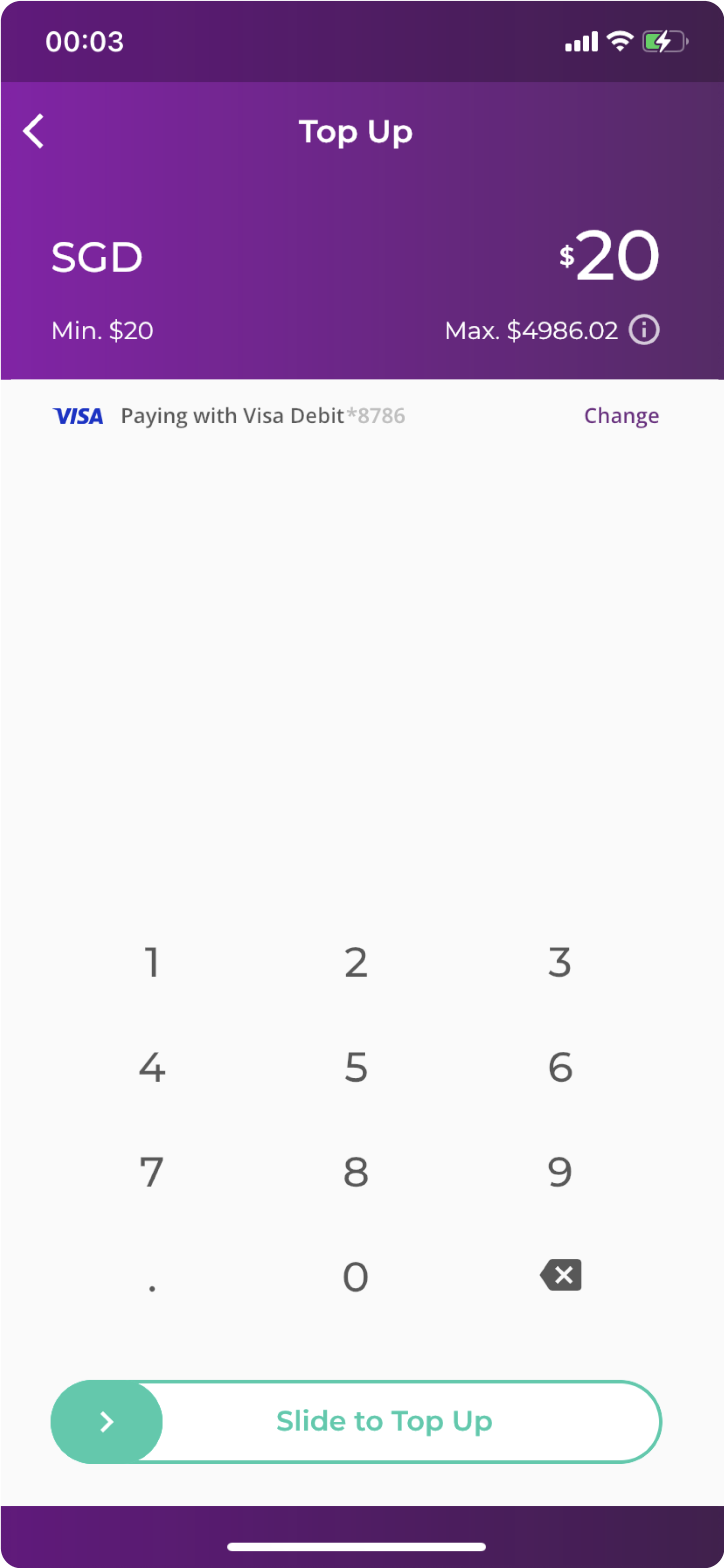
Simple & interactive top-up procedures →
Review first! A feature update on the top up page includes a “next button”. This feature prompts users to check the amount first before a successful top-up, reducing the room for mistake.

Stay up-to-date with your wallet activities →
Keeping users’ accountable for their card activity - Enable email notification to receive an e-statement on their daily wallet activity, encouraging them to track and easily identify discrepancies right from the get-go.

05 Usability testing
Upon completion of the high fidelity prototype, I conducted a usability test with 3 participants in which I have consolidate their feedback and get insights from our solution. These were some of the observations and feedbacks received:
It has been observed that 2/3 testers tend to click on the filter option more than the drop down menu as it caters for specific searches. They do not want to scroll through the list of transactions although it has been categorised in theme.

3/3 of the testers felt that the expenses overview is useful on the main dashboard as it notifies them of their current spending for the month. They find that it is easier to identify suspicious transaction on their wallet depending on the amount spent for the month.

3/3 of the testers were unaware of the ability to hover about the overall expenses chart to look at the respective spendings on each category.
